Goldstar Field Validation

Creating Goldstar's validation best practices

center

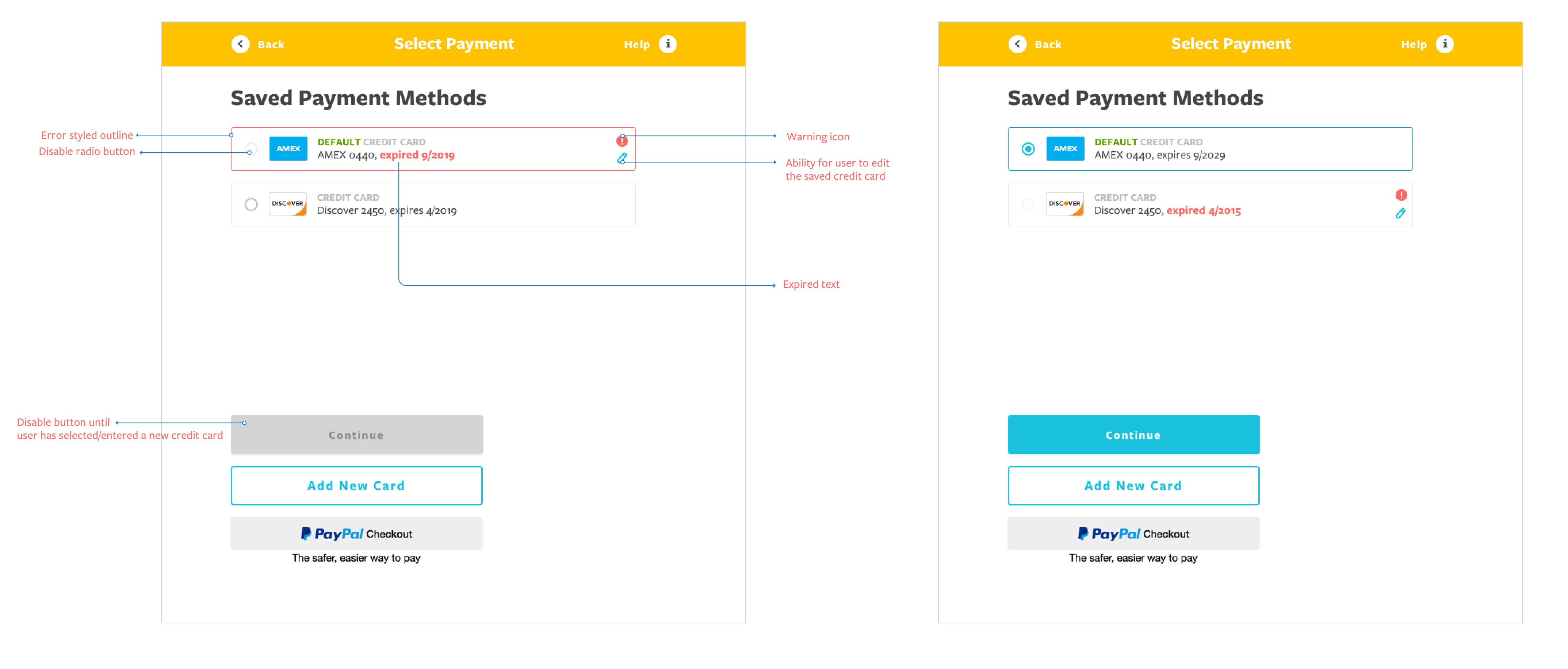
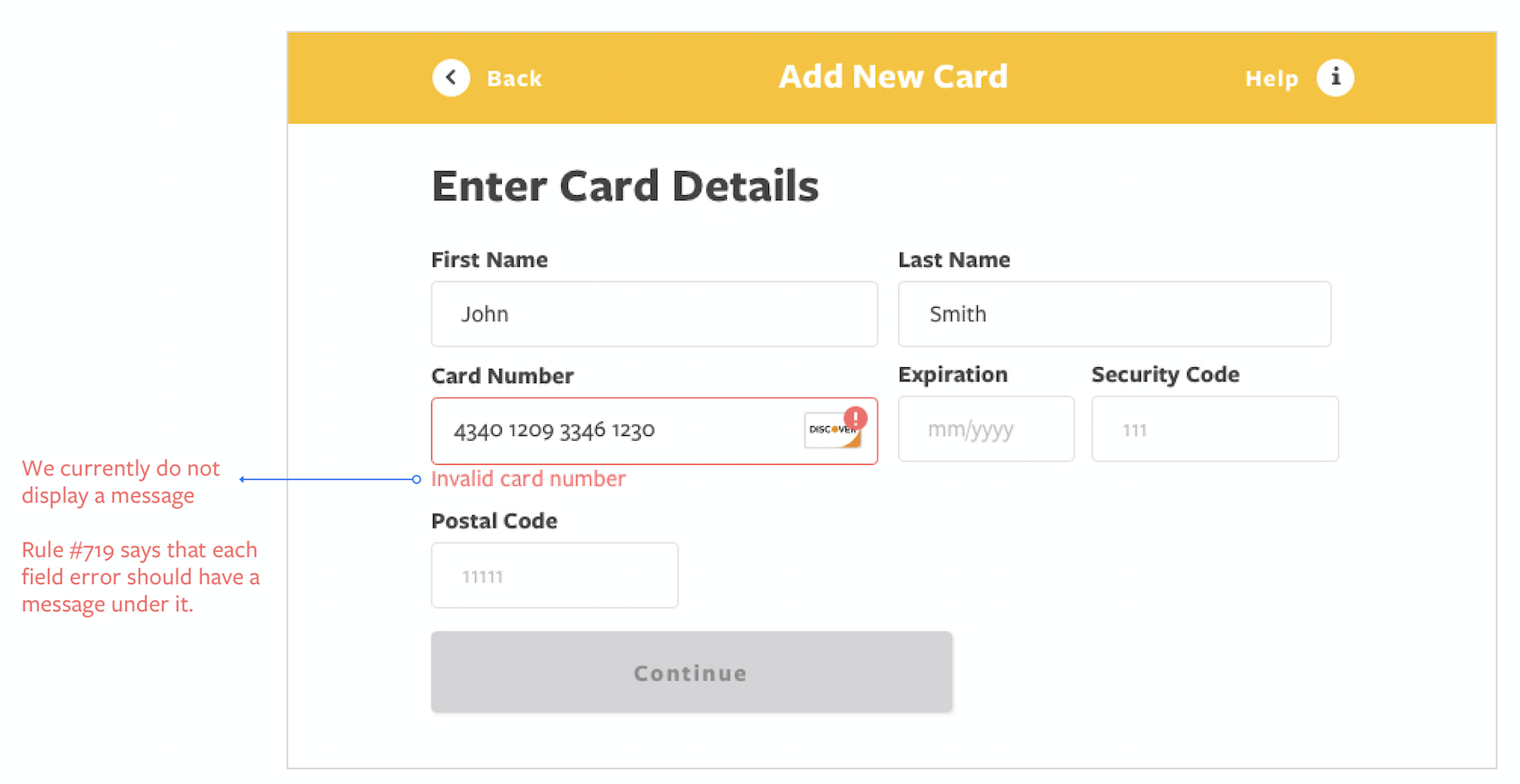
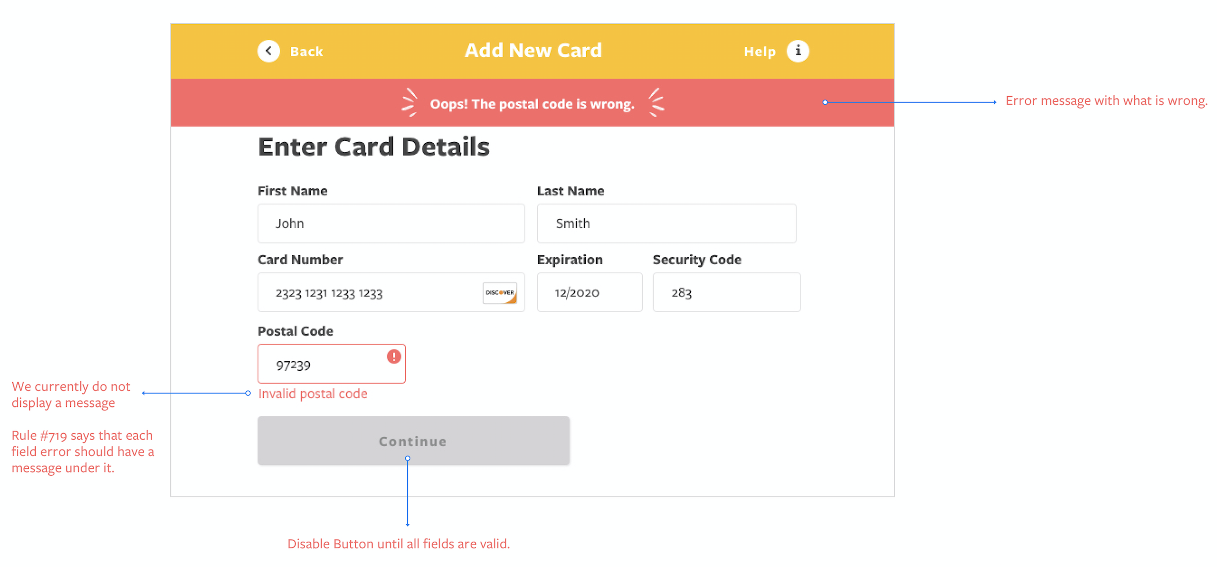
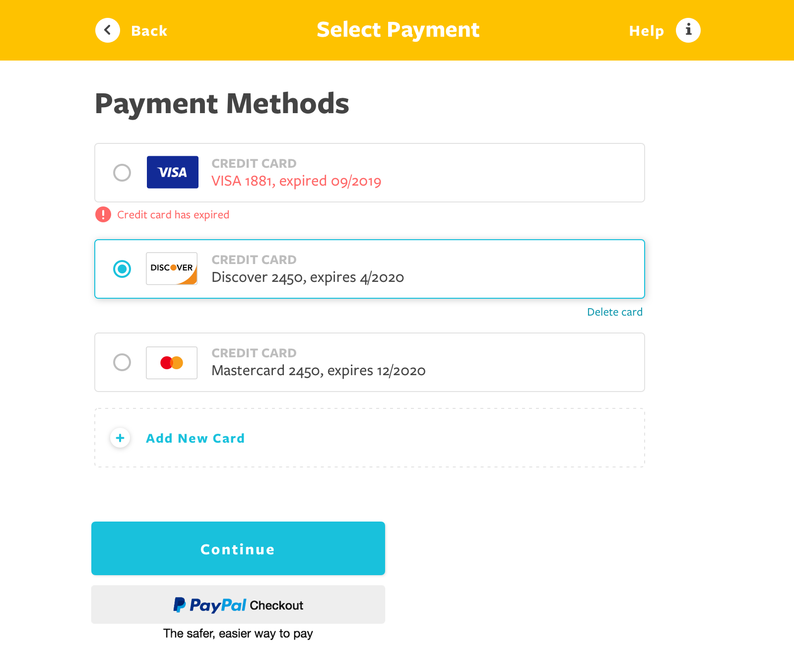
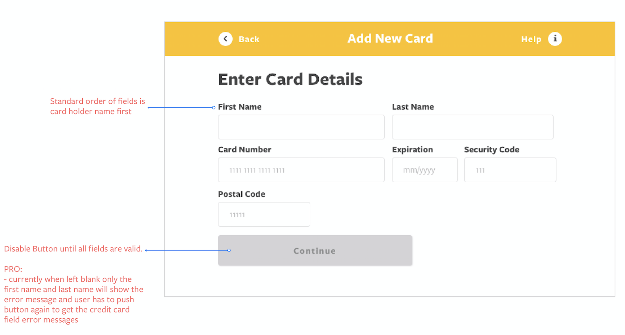
Users must be able to understand that an error occurred and exactly which fields cause it in order to resolve the error. Generic validation errors do little to help users understand, let alone correct the validation error.

Step 1: Understanding that something went wrong

And that there’s one or more incorrect inputs somewhere on the page they have to correct


Step 2: Spotting the fields

Enable the user to spot and understand which field(s) are incorrect

Step 3: Why the data is incorrect

Helping the user understand why the data entered is incorrect and how they can fit it.

Validation errors best practices

Minimize the validation errors

Indicating both required and optional fields

The checkout pages and long sign up forms need to explicitly mark both the required fields and optional fields.

Indicating both required and optional fields

Additional feature and field explanations are often needed by some users, yet can take unnecessary focus for users who don’t need them. Limit permanent descriptions of fields or features to clarifications important to the majority of users, and keep them short. Use tooltip text for all infrequently used or lesser-known fields, selections, and features.

Auto-format inputs

When faced with a field with formatting requirements or character restrictions, users are often hesitant or confused on how to proceed correctly.

When provided with a format example, 89% of test subjects entered e.g. their phone number in a different format than what the site had exemplified.

The action taken right after submit

Auto-scroll

If there is only one error on a page, auto-scroll can be utilized in order to present the error to the user right within their viewport.

List errors at top of page

Take users to the top of the page with a universal error statement outlining the multiple errors that have been detected, and potentially what they are. This is of course in addition to then highlighting each of the fields through the page, each with their own unique error message.

Live in-line validation

Alerts user of their mistake as they leave the field. Can instantly notice the error and return to fix it. The live in-line validation prevents user from getting dedicated error page and allows them to fix the input while it’s fresh in their mind.

Error Message Placement

Not at the top of the page

When the error message is listed only at the top of the page – makes it needlessly difficult to even spot the unmarked erroneous fields, but also to correct the value, as the error message will often be out of view once users scroll down to the incorrect field.

Why it matters

as many as 43% of subjects failed to identify the error on their first scan of the page.

If the error message is not displayed right next to the incorrect field, it can be difficult to make the necessary corrections, since the error message can be out of view.

Design Patterns

The incorrect field must always be marked up

Typically using red field borders, field background color, or red arrows.

Have individual field’s error message

Must always be displayed right next to the erroneous field to allow users to understand what went wrong and how to correct it.

If the site cannot reliably determine or communicate which of multiple fields caused the error, it’s important that the error design is clear about all fields that can potentially have caused the error, while only displaying just one error message.